

In machine learning projects, statistical analysis is done on the datasets to identify how the variables are related to each other and how it is dependent on other variables. To find the relationship between the variables, you can plot the correlation matrix.
You can plot correlation matrix in the pandas dataframe using the df.corr() method.
What is a correlation matrix in python?
A correlation matrix is a matrix that shows the correlation values of the variables in the dataset.
When the matrix, just displays the correlation numbers, you need to plot as an image for a better and easier understanding of the correlation. A picture speaks a thousand times more than words.
If you’re in Hurry
You can use the below code snippet to plot correlation matrix in python.
Snippet
corr = df.corr()

corr.style.background_gradient(cmap='coolwarm')
If You Want to Understand Details, Read on…
In this tutorial, you’ll learn the different methods available to plot correlation matrices in Python.
Table of Contents
Sample Dataframe
First, you’ll create a sample dataframe using the iris dataset from sklearn datasets library.
This will be used to plot correlation matrix between the variables.
Snippet
import pandas as pd

from sklearn import datasets

iris = datasets.load_iris()

df = pd.DataFrame(data=iris.data, columns=iris.feature_names)

df["target"] = iris.target

df.head()
The dataframe contains four features. Namely sepal length, sepal width, petal length, petal width. Let’s plot the correlation matrix of these features.
Dataframe Will Look Like
| sepal length (cm) | sepal width (cm) | petal length (cm) | petal width (cm) | target | |
|---|---|---|---|---|---|
| 0 | 5.1 | 3.5 | 1.4 | 0.2 | 0 |
| 1 | 4.9 | 3.0 | 1.4 | 0.2 | 0 |
| 2 | 4.7 | 3.2 | 1.3 | 0.2 | 0 |
| 3 | 4.6 | 3.1 | 1.5 | 0.2 | 0 |
| 4 | 5.0 | 3.6 | 1.4 | 0.2 | 0 |
Finding Correlation Between Two Variables
In this section, you’ll calculate the correlation between the features sepal length and petal length.
The pandas dataframe provides the method called corr() to find the correlation between the variables. It calculates the correlation between the
two variables.
Use the below snippet to find the correlation between two variables sepal length and petal length.
Snippet
correlation = df["sepal length (cm)"].corr(df["petal length (cm)"])

correlation
The correlation between the features sepal length and petal length is around 0.8717. The number is closer to 1, which means these two features are highly correlated.
Output
0.8717537758865831This is how you can find the correlation between two features using the pandas dataframe corr() method.
How to Infer Correlation between variables
There are three types of correlation between variables.
- Positive Correlation
- Negative Correlation
- Zero Correlation
Positive Correlation
When two variables in a dataset increase or decrease together, then it is known as a positive correlation. A positive correlation is denoted by 1.
For example, the number of cylinders in a vehicle and the power of a vehicle are positively correlated. If the Number of cylinders increases, then power also increased. If the number of cylinders decreases, then the power of the vehicle also decreases.
Negative Correlation
When one variable decreases and the other variable decrease or vice versa means, then it is known as a negative correlation. A negative correlation is denoted by -1.
For example, the number of the cylinder in a vehicle and the mileage of a vehicle is negatively correlated. If the number of cylinders increases, then the mileage would be decreased. If the number of cylinders decreases, then the mileage would be increased.
Zero Correlation
If the variables don’t relate to each other, then it is known as zero correlation. Zero correlation is denoted by 0.
For example, the color of the vehicle makes zero impact on the mileage. This means color and mileage are not correlated to each other.
Infer the number
With these correlation numbers, the number which is greater than 0 and as nearer to 1, it shows the positive correlation. When a number is less than 0 and as closes to -1 shows a negative correlation.
This is how you can infer the correlation between two variables using the numbers.
Next, you’ll see how to plot the correlation matrix using the seaborn and matplotlib libraries.
Plotting Correlation Matrix
In this section, you’ll plot the correlation matrix by using the background gradient colors. This internally uses the matplotlib library.
First, find the correlation between each variable available in the dataframe using the corr() method. The corr() method will give a matrix with the correlation values between each variable.
Now, set the background gradient for the correlation data. Then, you’ll see the correlation matrix colored.
Snippet
corr = df.corr()

corr.style.background_gradient(cmap='coolwarm')
The below image shows the correlation matrix.
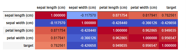
The dark color shows the high correlation between the variables and the light colors shows less correlation between the variables.
This is how you can plot the correlation matrix using the pandas dataframe.
Plotting Correlation HeatMap
In this section, you’ll learn how to plot correlation heatmap using the pandas dataframe data.
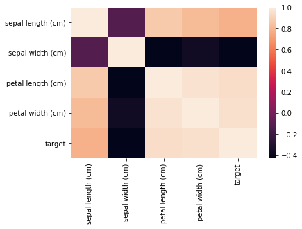
You can plot the correlation heatmap using the seaborn.heatmap(df.corr()) method.
Use the below snippet to plot the correlation heatmap.
Snippet
import seaborn as sns

sns.heatmap(df.corr())

plt.savefig("Plotting_Correlation_HeatMap.jpg")
This will plot the correlation as a heatmap as shown below.
Here also the dark color shows the high correlation between the values and the light colors shows less correlation between the variables.
Adding Title and Axes Labels
In this section, you’ll learn how to add title and the axes labels to the correlation heatmap you’re plotting using the seaborn library.
You can add title and axes labels using the heatmap.set(xlabel=’X Axis label’, ylabel=’Y axis label’, title=’title’).
After setting the values, you can use the plt.show() method to plot the heat map with the x-axis label, y-axis label, and the title for the heat map.
Use the below snippet to add axes labels and titles to the heatmap.
Snippet
import seaborn as sns

import matplotlib.pyplot as plt

hm = sns.heatmap(df.corr(), annot = True)

hm.set(xlabel='\nIRIS Flower Details', ylabel='IRIS Flower Details\t', title = "Correlation matrix of IRIS data\n")

plt.show()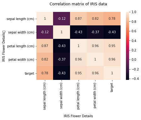
Saving the Correlation Heatmap
You have plotted the correlation heatmap. Now, you’ll learn how you can save the heatmap for future reference.
You can save the correlation heatmap using the savefig(filname.png) method
It supports jpg and png format file exports.
Snippet
plt.savefig("Plotting_Correlation_HeatMap_With_Axis_Titles.png")This is how you can save the correlation heatmap.
Plotting Correlation Scatter Plot
In this section, you’ll learn how to plot the correlation scatter plot.
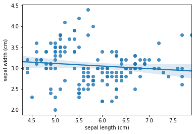
You can plot the correlation scatterplot using the seaborn.regplot() method.
It accepts two features for X-axis and Y-axis and the scatter plot will be plotted for these two variables.
It also supports drawing the linear regression fitting line in the scatter plot. You can enable it or disable it using the fit_reg parameter. By default, the parameter fit_reg is always True which means the linear regression fit line will be plotted by default.
With Linear Regression Fit Line
You can use the below snippet the plot the correlation scatterplot between the variables sepal length and sepal width. Here, the parameter fit_reg is not used. Hence the linear regression for line will be plotted by default.
Snippet
import seaborn as sns

# use the function regplot to make a scatterplot
sns.regplot(x=df["sepal length (cm)"], y=df["sepal width (cm)"])

plt.savefig("Plotting_Correlation_Scatterplot_With_Regression_Fit.jpg")
You can see the correlation scatter plot with the linear regression fit line.
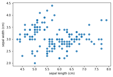
Without Linear Regression Fit Line
You can use the below snippet the plot the correlation scatterplot between the variables sepal length and sepal width. Here, the parameter fit_reg =False is used. Hence the linear regression for line will not be plotted by default.
Snippet
import seaborn as sns

# use the function regplot to make a scatterplot
sns.regplot(x=df["sepal length (cm)"], y=df["sepal width (cm)"], fit_reg=False)

plt.savefig("Plotting_Correlation_Scatterplot_Without_Regression_Fit.jpg")
You can see the correlation scatter plot without the linear regression fit line.
This is how you can plot the correlation scatter plot between the two parameters using the seaborn library.
Plot Correlation Between Two Columns Pandas
In this section, you’ll learn how to plot correlation Between Two columns in pandas dataframe.
You can plot correlation between two columns of pandas dataframe using sns.regplot(x=df[‘column_1’], y=df[‘column_2’]) snippet.
Use the below snippet to plot correlation scatter plot between two columns in pandas
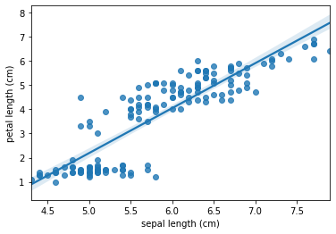
Snippet
import seaborn as sns

sns.regplot(x=df["sepal length (cm)"], y=df["petal length (cm)"])
You can see the correlation of the two columns of the dataframe as a scatterplot.
Conclusion
To summarize, you’ve learned what is correlation, how to find the correlation between two variables, how to plot correlation matrix, how to plot correlation heatmap, how to plot correlation scatterplot with and without linear regression fit line. Additionally, you’ve also learned how to save the plotted images that can be used for future reference.
If you’ve any questions, comment below.